In the quest for taking great pictures it’s easy to read about a tool, technique, software or workflow that can become a time and money wasting obsession. In my case I became obsessed with color accuracy in my pictures. I wanted skin tones to look real, I wanted colorful dresses to look like they did through my eyes and more importantly my product photography needed to accurately capture the products true colors.
My whites need to be white and not gray or yellow, my blacks need to be black and also not gray. Of course the colors in between need to be natural and accurate as well. It’s not as easy for others to know if a dress in a picture is the correct royal blue or vivid red. However even an untrained eye notices when blacks and whites are not accurate.

Calibrated Monitors
This quest lead me down two paths. The first path was computer monitor color calibration and the second was what’s called “white balance” or “color balance“. The computer monitor color calibration turned out to be a big waste of time and money. I bought two very expensive Dell Ultrasharp IPS monitors and a DataColor Spyder to calibrate them. Upon calibration the calibrated monitors did not match each other. I would literally split an image between the two screens and the two halves would look drastically different. This had me thinking that maybe one monitor was bad. Fortunately I also used one of these monitors at the day job. I borrowed my work monitor and added it to the mix. The results were the same. None looked bad but when put side by side they just didn’t look the same. I was frustrated to put it mildly.
This got me thinking I’m spending time and money to make my pictures look great for other peoples notebooks, monitors, iphones and tablets that ARE NOT CALIBRATED. It was then I decided that my ipad, notebook and iphone image quality was more important than my having a color accurate desktop or notebook monitor. If the pictures looked great on my devices that’s sufficient for my needs.

Now it’s important to note if your photography requires an end result of accurately printed media you absolutely need a calibrated monitor and a few other steps but you should look at monitors actually meant for photography and graphic artists, brands like EIZO and they aren’t cheap or you need to buy an Apple imac pro or macbook pro and again be prepared to dig deep in your wallet.
Professional photographers also want color accurate monitors to get the most out of their photographs from software. I think folks reading this page are probably not anywhere near that level and the time and money can be better spent on other photographic gear, software and training.
These days I’m using a stock LG 34″ WQHD UltraWide Monitor. It’s one screen, the image colors aren’t bad and using one monitor removes the aggravation of the monitors not matching. Meanwhile the young man across the street enjoys gaming on my Dells.
Photography versus Photoshop
Today photography seems to be becoming more about photoshop, filters and editing skills than photography. I’m not opposed to this as an art form but it’s very misleading and discouraging to folks just starting out in photography or who simply aren’t into editing on a computer. I think even folks who understand that an image is photoshopped might not realize exactly to what degree. These days a single finished picture can be a composite of pictures shot over many hours and days. The pictures are layered over each other with elements masked out or unmasked. Pictures of models have every inch of them filtered, stretched, shrunk while body parts are tweaked and swapped. All that is probably well beyond visitors to this site or page. My goal is to simply help folks take the best pictures they can right from the lens. While editing in software is almost unavoidable I try to minimize it and keep it simple. I’m about taking pictures and not software. That brings me to the main subject of this page, “White Balance”.
White Balance – Color Balance
When I bought my first DSLR a Nikon D90 I was taking some pictures of some parkerized and matte black firearms and was frustrated that the colors were not as accurate as I wanted. I had an understanding of the built in white balance presets like, auto, flash, tungsten, fluorescent, sun, shade and even manual white balance. I knew to match my shooting conditions, If I shot under the light in my apartment I used the tungsten setting, at the office I used fluorescent and with my JTL softbox I manually set the color to 2700k to match the 2700k of the light bulb. The results were pretty good but not great, not what I was after. A quick chat with a photographer friend lead me to the introduction to my camera’s custom white balance controls.
What is White Balance? Wikipedia describes it like this:
In photography and image processing, color balance is the global adjustment of the intensities of the colors. An important goal of this adjustment is to render specific colors, particularly neutral colors, correctly. Hence, the general method is sometimes called gray balance, neutral balance, or white balance.
Basically white balance is about getting colors rendered accurately either directly from your camera while taking your pictures “in camera” or getting it right in “post processing” in Adobe Photoshop or preferably Adobe Lightroom.
Auto White Balance
You yourself have probably taken pictures or seen pictures where the colors do not look right. Often times the first thing you notice is that whites have a yellow or blue tint to them. Or maybe the subject of the photo is something you know well and the colors do not represent how it appears to you. The reason for this can be typically traced to the camera being set to “auto white balance”. A camera set for automatic white balance will do it’s best interpretation to determine how the pictures colors should appear. Most modern cameras do a good job with white balance but often there is room for a lot of improvement and that comes from setting a custom white balance with an 18% gray card or similar tool.
White Balance Presets
I mentioned above about white balance presets. I believe all modern DSLR’s come with white balance presets to cover most lighting conditions. These presets are typically, Sunshine or Daylight, Tungsten, Fluorescent, Shade, Flash, Manual or K, Auto and Custom. All the presets are designed for the camera user to match the conditions of the light source. Some of the presets are pretty obvious. Tungsten is for shooting under incandescent lighting, fluorescent, sunshine, shade and flash don’t need an explanation.
Manual White Balance or ‘K”
The manual or “K” presets are a little different. They are meant for the user to manually choose a color temperature that is measured in “Kelvins” hence Nikon’s use of the letter “K”. An example of a use for this is my softbox uses a tungsten light bulb and the specifications tell me the light bulb is 3000k. I could simply set manual white balance and select 3000k from the list and be good to go. That actually works pretty good because the color temperature is known to me. However it’s my experience that the stated color temperature is not completely accurate and manual tweaking of the color temperature is often required. Using a custom white balance determined from an 18% gray card is far more accurate and faster.
Custom White Balance
Custom white balance is the solution to getting accurate colors in your pictures. I know the term white balance might sound intimidating so think of it as it’s alternate term “Color Balance” and it sounds less intimidating. Creating a custom white balance is incredibly easy and should become part of your picture taking process. By the always shoot in RAW format for your pictures. I shoot large raw, large jpeg with my Nikon D810.
Setting White Balance

The first part of setting white balance is incorporating an 18% gray card into your pictures or something that achieves the same end result as a gray card.
18% Gray Card White Balance Method
In Camera White Balance – Camera manufacturers have a couple methods for setting a custom white balance with Nikon you set the camera to “pre” mode and photograph your subject with the gray card in the picture. The camera understands to look for the 18% gray card and calibrates off that. If your calibration is good the camera will inform you as much. Canon on the other hand has you take the same picture but you must manually select the picture as your white balance reference source. Regardless once complete your colors will look natural and accurate
White Balance Post Processing – Setting white balance in post requires taking a picture with a gray card in it and later in software using the eyedropper tool to select the gray card reference photo. The software will then adjust accordingly. If your going to correct it in post production your best to use lightroom because white balance can be adjusted in bulk with a couple clicks.
White Balance Other Methods
There are ways of achieving white balance that don’t use an 18% gray card. These include special lens caps or covers, color palettes as well as less accurate means such as using something white or grey in the environment. I’ll discuss the former individually below.
My Favorite White Balance Tools
- Fstoppers Flash Disc Portable Light Modifier
- Lastolite Collapsible EzyBalance 18% Gray Card
- Datacolor X-Rite Colorchecker Passport Photo
- ExpoImaging ExpoDisc 2.0 White Balance Filter
- WhiBal G7 White Balance Pocket Card
- Fstoppers Flash Disc Portable Light Modifier is my primary white balance tool these days for photographing people and pets outdoors.The reason is because the Flash Disc is not just a gray card but it’s also a wonderful flash or speedlight diffuser. One side of the Flash Disc is a beautiful white diffuser and the other side has an 18% gray stripe for setting white balance. The diffuser is great for human subjects as it’s diffusion is soft and even while creating round catch lights in the eye. It would also be well suited in the studio for people and product photography. The fstoppers video below speaks of the Flash Disc versatility. The flash disc also packs very small. I own two of these.
- Lastolite Collapsible EzyBalance 18% Gray Card is a compact 18% gray card that also sees a lot of use. I use the EzyBalance in the studio almost exclusively. I also will bring it to any formal shoots from corporate, commercial, industrial, residential, basically anywhere Im shooting a large item or a room. I also will include it in a reference photo at just about any staged shot. It’s a generous sized target that’s made well and folds up very small.
- Datacolor X-Rite Colorchecker Passport Photo is a much different type of tool. It’s meant to be used in post production. Essentially you photograph a special calibrated color palette the same way you would for an 18% gray card but in post processing you use special software and custom profiles to recognize the palette in your image and automatically adjust accurately. The Colorchecker is a pretty involved tool and probably aimed at professionals who also need calibrated monitors and printer. Regardless it’s unparalleled for accuracy if you have the time to invest. The manual is also a great explanation on color balance, it can be downloaded below. I don’t use the ColorChecker often because it’s overkill for most of what I do, however it is always in my camera bag ready to be in a reference photo because it takes up almost no room.
- ExpoImaging ExpoDisc 2.0 White Balance Filter is another specialty tool. It’s not a grey card but rather a specially designed lens cap designed for setting white balance. With my Nikons you simply set the camera to custom white balance aka “pre” and in manual focus aim the camera at your target and take a picture and voila! white balance is set. This works and works well. I mostly use it outdoors where the light is ever changing. I still typically take a reference photo with an 18% card if the scene and conditions permit. The thing with the Expodisc is it’s always on the camera and you don’t need any other white balance tool. The expodisc 2.0 is only available in a couple lens sizes so you just need a set of threaded filter adapters and your covered.
- WhiBal G7 White Balance Pocket Card is my least used grey card and like the ColorChecker Passport it’s meant to be used in post. It’s design is and small like carrying a credit card or tradeshow badge.
ExpoImaging ExpoDisc 2.0 White Balance Filter
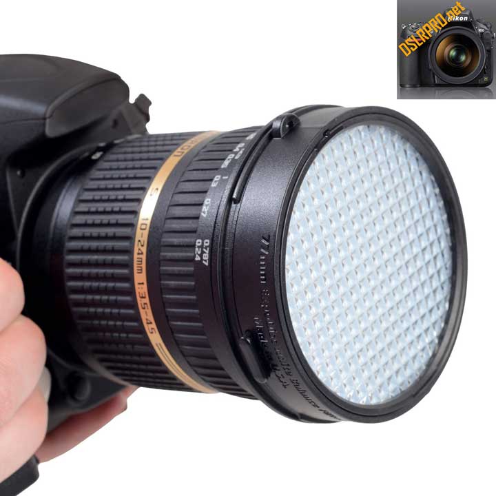
The ExpoImaging ExpoDisc 2.0 White Balance Filter features 18% calibrated light transmission for ensuring correct exposure and white balance settings while shooting and editing. The ExpoDisc attaches to threaded lenses or filters via a button-activated spring attachment. This is even compatible with low-profile filter threads. Also, the ExpoDisc 2.0 can be used with smaller lenses by simply holding the filter in front of the lens.
The ExpoDisc 2.0 can also be used to dust map your sensor due to the neutral image it creates. Additionally, two warming filters are included that are inserted into recesses on the face of the filter. These two levels of warming add warmth for more pleasing skin tones. Each filter is made and calibrated in the USA for accuracy and includes a lanyard and carrying case. Download the ExpoDisc 2.0 Instructions.
Lastolite Collapsible EzyBalance 18% Gray Card

The Ezybalance is a revolutionary tool, ideal for adjusting color balance and exposure settings in both digital and film format cameras, as well as DV cams. The Ezybalance gives accurate color rendition to cameras by providing a pure white surface upon which the camera can perform a white balance. The other side of the Ezybalance provides an 18% gray card surface suitable for adjusting the camera to get the most accurate exposure setting.
The Lastolite Collapsible EzyBalance 18% Gray Card is a handy double sided ‘pop up’ grey/white card which simplifies the complex technical issues surrounding exposure and colour correction when working in different lighting conditions. A Unique focusing target enables the camera to focus on the card and take the necessary readings. Download the Lastolite Collapsible EzyBalance Gray Card Instructions.
- Color correction pre- and post-capture
- Exposure control pre- and post capture
- Accurate color rendition
- Collapsible, durable, and cleanable
- Double-sided grey and white Unique focusing target For use with digital or film photography
Datacolor X-Rite Colorchecker Passport
Reduce your image processing time and improve quality control in your Raw or JPEG workflow with the powerful color capabilities of the Datacolor X-Rite Colorchecker Passport Photo. Quickly and easily capture accurate color, instantly enhance portraits and landscapes, and maintain color control and consistency from capture to edit.
ColorChecker Passport Photo is a powerful ‘capture to edit’ color solution for any photographer looking for more accurate, consistent color and creative flexibility. And when you combine ColorChecker Passport Photo with Adobe® Imaging solutions you’ll gain even greater benefits.
ColorChecker Passport Photo combines three photographic targets into one pocket size protective, multi-positionable case that adjusts to any scene. Together with the included camera calibration software, you get the ultimate in functionality, flexibility and portability.
There are so many ways to incorporate ColorChecker Passport Photo into your Raw workflow. Whether you take advantage of the entire solution, or just a couple of ColorChecker Passport’s many features, you’ll realize improved quality and productivity almost immediately.
ColorChecker Passport Photo offers you an unparalleled tool to attain full color control and customized creative enhancement from image capture to post-processing.
The art of color management is all about getting your colors to match from input to output. That means your camera captures true colors, your monitor displays them accurately, and your printer produces a photo that matches what you see on screen. The ColorChecker Passport Photo is an essential component to attaining a 100% color-managed workflow. Plus, the included Enhancement target helps you take your vision one step further by providing the creativity to quickly and easily edit and express your colors just as you’ve always imagined. Whether it’s a studio shot, a colorful nature scene or a multiple photo event, you can extend the power of your photo editing software with one-click enhancements that articulate your inspiration.
Shooting Raw provides greater flexibility to color-adjust images based on how a particular camera captures color. A calibrated Raw workflow minimizes color differences between cameras and lenses, adapts for mixed lighting, and makes it possible to color match across different scenes. ColorChecker Passport Photo makes the camera calibration experience fast and easy. You’ll have greater capability to edit color because you’re starting with a consistent foundation. Plus, you’ll be able to take advantage of your Raw processing software to automatically apply your profiles to a large number of images.
If your Raw processing application does not support custom DNG profiles, you can still use ColorChecker Passport Photo to provide a physical reference for color editing. The Enhancement Target also offers such things as exposure evaluation and one-click white balancing for Raw editing packages that support these features.
The ColorChecker Passport Photo includes the following features:
WHITE BALANCE TARGET
Starting with an accurate white balance ensures the colors you capture are true and provides a point of reference for post-shoot editing.
The ColorChecker White Balance target is a spectrally flat target that provides a neutral reference point across different lighting conditions that you encounter during a photo shoot. Since the target reflects light equally across the visible spectrum, creating an in-camera custom white balance can properly compensate for varying lighting.
You’ll be able to:
- Eliminate color casts
- Improve the color preview on your camera’s display so your histograms are more reliable
- Make post production color editing faster and easier by eliminating the need to neutralize each image individually
Setting a custom white balance for each lighting situation will make the previews on your camera’s built in display more color correct, make your histograms more reliable, and speed up post production color editing. Raw shooters can capture anytime during the session to gain these benefits, while JPEG shooters should make it your first shot.
- Download Datacolor Colorchecker Passport Photo Instruction Manual
- Download Datacolor ColorChecker Camera Calibration Software
- Download Datacolor ColorChecker DNG Profile Manager Software
- Download Datacolor ColorChecker Passport Brochure
- Download Datacolor ColorChecker Passport Photo Targets
- Download Datacolor ColorChecker Passport Photo Target Brochure
- Download Datacolor ColorChecker Passport Video Brochure
Fstoppers Flash Disc Portable Light Modifier
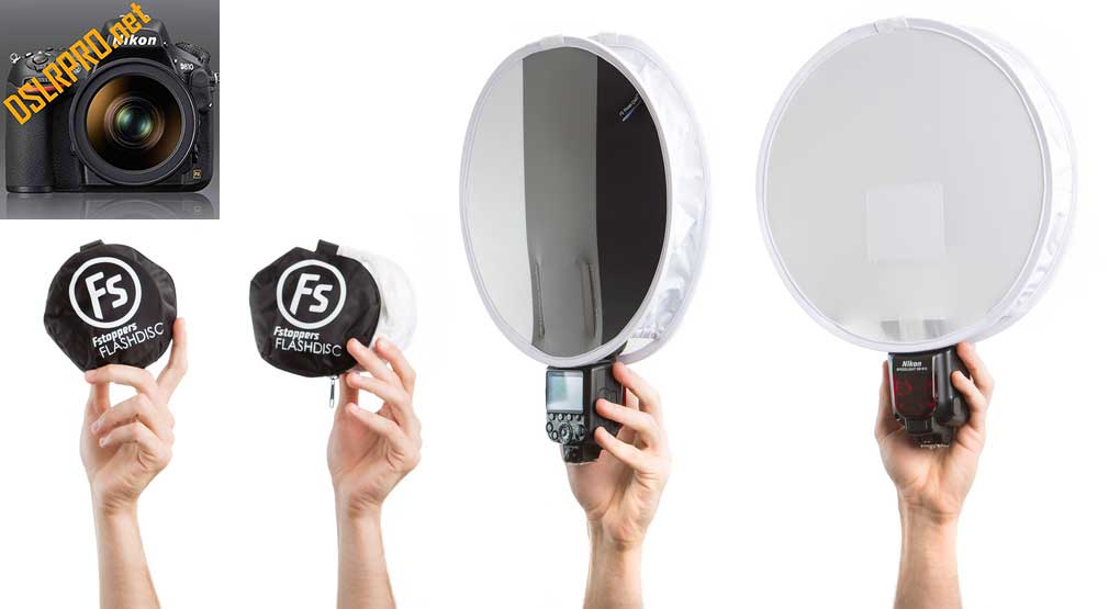
Pocket Sized: The Fstoppers Flash Disc Portable Light Modifier (patented) is a simple but extremely versatile light modifier for small speedlights. Lee Morris’s original idea was to have a small portable softbox on him at all times during his weddings. What makes the Flash Disc so useful is it literally folds up like a reflector and can fit into your pocket, jacket, roller bag, or backpack. The unique design allows your portable flash to “bounce” up and fill the entire circular chamber crating a quality of light that is much softer than your speedlight’s small opening.
Portable: Unlike traditional softboxes, the Flash Disc is very portable and has an extremely small profile. This makes it easy to move through large crowds like you would find at an event or a wedding. Long gone are the days of raising bulky softboxes over people’s heads or accidentally bumping your umbrella on a light stand into guests at a wedding. The Flash Disc can easily be held by your side and takes up about as much space as a hardcover book.
Usefulness: Here are some of the situations in which we have found the Flash Disc to work best:
- Great for small product shots where large softboxes are often overkill
- Perfect for impromptu group shots when you want soft directional light
- Nice when you want your key light softer than a bare bulb speedlight but more contrasty than a huge softbox
- A fast and easy solution for detail shots such as rings, cakes, shoes, jewelry
- Easily isolates small areas for light painting (ala Mike Kelley’s technique)
- Convenient for packing in your travel bag when you don’t know what photo shoots await
- Reliable in windy environments where traditional softboxes and umbrellas often fail
- Extremely useful during fast paced subjects like children or toddlers.
and most importantly,
- Invaluable when shooting by yourself and you need to hold your own off camera lighting in your left hand!
WhiBal G7 White Balance Pocket Card
To get the best from your digital camera, use a gray card to accurately set white balance. The WhiBal G7 White Balance Pocket Card is an extremely accurate, convenient gray card that fits in a shirt pocket, and can be used in any shooting situation. It can also be used to set neutral White and Black reference areas for setting dynamic range in digital capture using the Black and White Eyedroppers available within Lightroom and other RAW conversion software, Photoshop and most other editing software.

By photographing a gray card reference for each lighting situation, you’ll be able to achieve a proper white balance for all of your pictures. The gray card reference picture can be used with software to balance the color casts that various lighting conditions produce with all digital cameras.
- Spectrally neutral–reflects all colors through the spectrum equally. The G7 Reference Card has both *a and *b Lab channel values of less than 1 at D50 and are spectrally “flat”. It’s spec’d at less than +/- 0.5.
- Maintains its spectral neutrality under all reasonable temperature and environmental conditions.
- Rugged–waterproof and scratch proof (color goes all the way through, not just a coating on top).
- Does not respond to UV light any differently than the visible spectrum.
- Each card is individually measured with a precision spectrophotometer to certify that it meets or exceeds stringent specifications.
- Designed for low reflectivity, except that the sticker is intentionally highly reflective so that maximum TrueBlack Blackpoint level may be achieved by observing for maximum glare point.
- Can be used to set white balance reference, Black point and White point.
Having a Gray Card reference is the best assurance that the digital pictures that you capture will have the ability to be properly white balanced. Only with a proper white Balance can you be ensured of proper and accurate color, regardless of lighting conditions.
Unlike your eyes, a digital camera does not automatically see whites as white. It sees the color of the light reflected from the scene, hence blue-ish in Daylight and Orange-ish in incandescent lighting. By photographing the genuine WhiBal reference card in each lighting situation, you are assured of being able to achieve a proper White Balance, with accurate, natural colors and no color cast.
The WhiBal reference picture can be used with today’s software to balance the color casts that various lighting conditions produce with all digital cameras. The best method to properly White Balance your digital pictures is by using a Gray Card properly and shooting RAW. RAW Conversion Software such as Adobe Camera Raw, Lightroom, Capture One and Aperture and can then perfectly adjust all the captures that were shot under the same lighting conditions. And the beauty of the WhiBal® is that it is small enough to fit in your pocket or around your neck, so that it will be used on a regular basis. Remember that even the genuine WhiBal is useless if it sits in your camera bag.
Very simply, WhiBal combines all the best features of all available gray cards and meets or exceeds their technical performance in a unique package that can be used conveniently in all your shooting situations. In addition, WhiBal provides convenient, neutral White and Black reference areas for setting the black and white reference points using most any imaging software.
What are the Criteria for Selecting a Good Gray Card?
• It must be spectrally neutral. In other words it must be gray! Not close, but actual perfect gray. This means that it will reflect all colors through the spectrum equally. WhiBal cards have both *a and *b Lab channel values of 0 (+/-0.5) and are therefore spectrally “flat”!. And each card is individually measured to certify this spec.
- It must maintain its spectral neutrality under all reasonable temperature and environmental conditions. WhiBal does.
- It must be physically rugged. waterproof, scratch proof (color goes all the way through, not just a coating on top).WhiBal is.
- The Gray Luminance value must be in a range that is good for digital cameras. WhiBal rules!
Beyond technical specifications, the most important aspect of a Gray Card is that you use it. WhiBal® Pocket is the size of a US credit card (2×3.4 inches) so that it fits in your shirt pocket or wallet. WhiBal will be used and not be an accessory that lives in your camera bag.
WhiBal G7 White Balance Pocket Card Feature Summary
- It fits in your shirt pocket. (it’s the same size as a credit card …2×3.5 inches)… So you will actually use it rather than have it in your bag!
- It is basically indestructible, waterproof, etc.
- Pocket and Studio “Kit” versions come with convenient stand for ease of setup on tables or flat surfaces. No need for someone to hold the WhiBal.
- All 3 “Card” versions (Pocket, Studio, Reference Cards) are just the card alone.
- New Key Chain Card (1×2.2 inch) version comes complete with S-Biner attachment hardware (as shown).
- All 4 WhiBal versions are individually measured with a precision spectrophotometer to certify that each card shipped meets or exceeds our stringent specifications.
- The Gray card is designed for low reflectivity, except that the black patch is intentionally highly reflective so that maximum TrueBlack™ Blackpoint level may be achieved by observing for maximum glare point and then backing the angle down.
- Can be used to set white balance reference, Black point and White point.
- Fits shirt pocket or can hang on studio hook or lanyard. (Lanyard is supplied with Pocket version only).
Download: WhiBal G7 White Balance Pocket Card V10 Users Guide
To Be Continued…
Be the first to leave a review.